
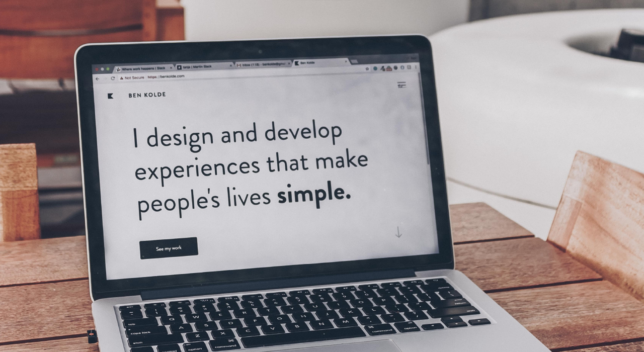
When building and designing a website, many people focus on making sure the site is crawler friendly in order to better the SEO of the site, and by doing this they miss out or forget to make the site user-friendly. There are lots of techniques and points to help you improve your user experience on your website ranging from the aesthetics to the functionality.
Site Speed
The speed of your site is crucial when it comes to user experience. Sites with loading speeds of three seconds and over have been proven to have far higher bounce rates and lower session durations than those with sub three second load times. The faster you can make your site, the better user experience you provide for your visitors.
Call to Actions
Without being spammy, there should be a call to action visible at all times on your website to encourage the visitor to convert. A lot of visitors will leave your website if they cannot easily find the information or place to convert or get in touch, so by adding a phone number button in the header or a contact button is a simple and clean way to avoid this issue.
Know your market
Your website might be targeted at a specific group of people with the sole purpose to provide information, and so you would want to fill your website with less imagery and more text. On the other hand you may have a website that would appeal better to your target market if it was more heavily focussed on imagery, and so you need to find out what would suit your site better by either asking known or existing visitors, or by checking competitor sites that are doing well.

Colours
We mentioned colour theory a lot in the past and it most certainly applies here. The colours that you choose on your website must be relevant and suitable for your industry, for example using light and vibrant colours on a funeral planning website isn’t appropriate and this will reflect on your business. You must also keep into mind the colour blends and clashes that could occur. Using white text on light colours will be hard to read and the same applies to black text on dark colours, as you can see in the image above the black text is very clear on the yellow inflatable, whereas if it was white it would be less clear.
Simple Navigation
The main navigation on your website should be clear, concise and easy to follow. It should not be littered with too many links or buttons, or too many dropdowns. With that being said, you also want people to be able to get onto any page of the website within 2-3 clicks, so this is something to keep in mind and to try find the right balance.
If you manage to meet these requirements and balance them as well as you can, you will begin to notice decreases in bounce rate and improved session duration. Making a user-friendly website isn’t easy and no website is perfect, but if you follow these pointers it will help you get that bit closer to perfection. If you would like more information on web design, you can explore the rest of our website or contact us.