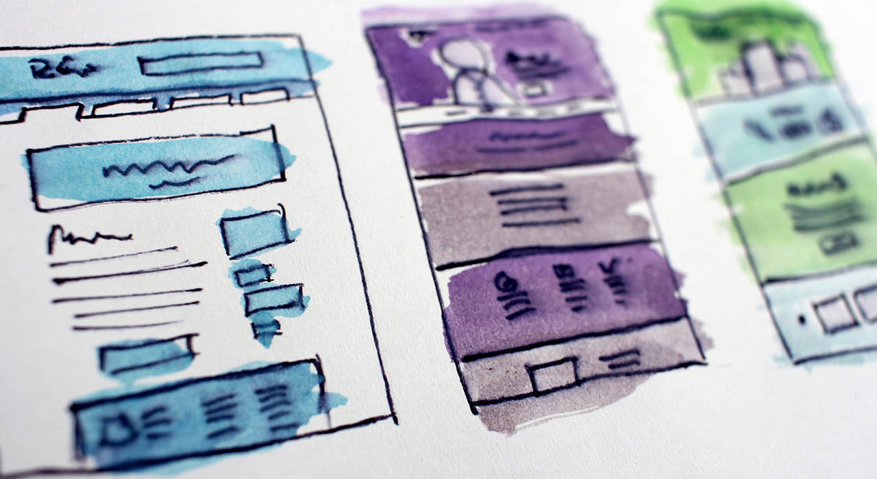
Landing pages are the pages that are designed to convert people who visit the page, and they are called landing pages because it is also optimised to be the first page a potential converter will visit or “land” on. There are many different ways to design your landing pages and even more ways to optimise them, some working well for certain sites and some not working. We’ve compiled some of the elements and things to consider when designing a landing page.
When someone visits the page, the first thing they should read is your H1 or heading. This heading usually is optimised for SEO purposes, but it also needs to sell your product or service. It also needs to clearly state what your page is about. The average consumer decides whether they are going to convert within 8 seconds, and with the heading being one of the first things they read, it is crucial that it is as close to perfection as you can get it.
If you have managed to convince your visitor to convert or have them right on the edge, they need to be able to get to the contact page or converting page. This requires you to have CTAs or call to actions. CTAs are buttons or links that take your visitor to the converting page. They need to be very clear, and there must always be a visible CTA on the page at all times. You don’t want to lose a potential buyer because they couldn’t find their way to the converting page, but you also don’t want to overwhelm your visitors with large, oversized and spammy.

Keeping content clear, simple and necessary goes a long way. As a visitor to a website, nothing puts you off more than text on text on text. This also goes for contact forms, the simpler the form, the more people will fill it out. Content that is cut down and only includes the essential information not only looks good and comes across as confident, but it also increases the chance of it all being read which increases the chance of a conversion.
Using powerful and professional images helps to compliment the page and build a feel for the service / product. If you use high-end and luxurious imagery, it will reflect this feel on the brand, and if you use stock images it looks cheap and lazy. Selecting the right images is definitely something that requires thought and if you are taking pictures, using a professional photographer will help you to capture the high quality and professional feel you need.
With more an more people using their phones instead of computers, it is crucial that your landing pages are mobile friendly. Not only does this improve the customer experience on the page, but it will actually also help you to rank better in Google’s search results.

Designing landing pages takes time, patience and research. Striving to build a unique layout that is effective is difficult in such a saturated online market. For any further advice or assistance, feel free to get in touch on our contact page.
