In our previous blog on top tips for logo design, we mentioned the use of colouring and how important it is. Colour is in fact one of the most influential factors when it comes to branding. You need to be able to understand the science behind the colours you use, and not just from an artistic standpoint.
Red
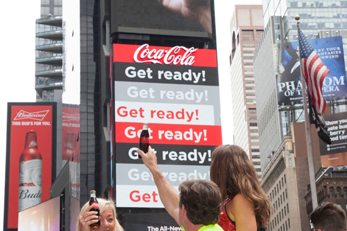
We will start off with the colour red as it is one of the most popular colours. Used by many businesses in a wide variety of industries, red is a very strong colour which gives off a lot of energy. It is used in so many industries because of it has a lot of connotations. Red can be a colour of anger, war, and danger but can also be associated with love, luck and elegance. It is important to keep these contrary feelings in mind when using this powerful colour, in order to make sure you emit the right emotions for your brand.
Orange
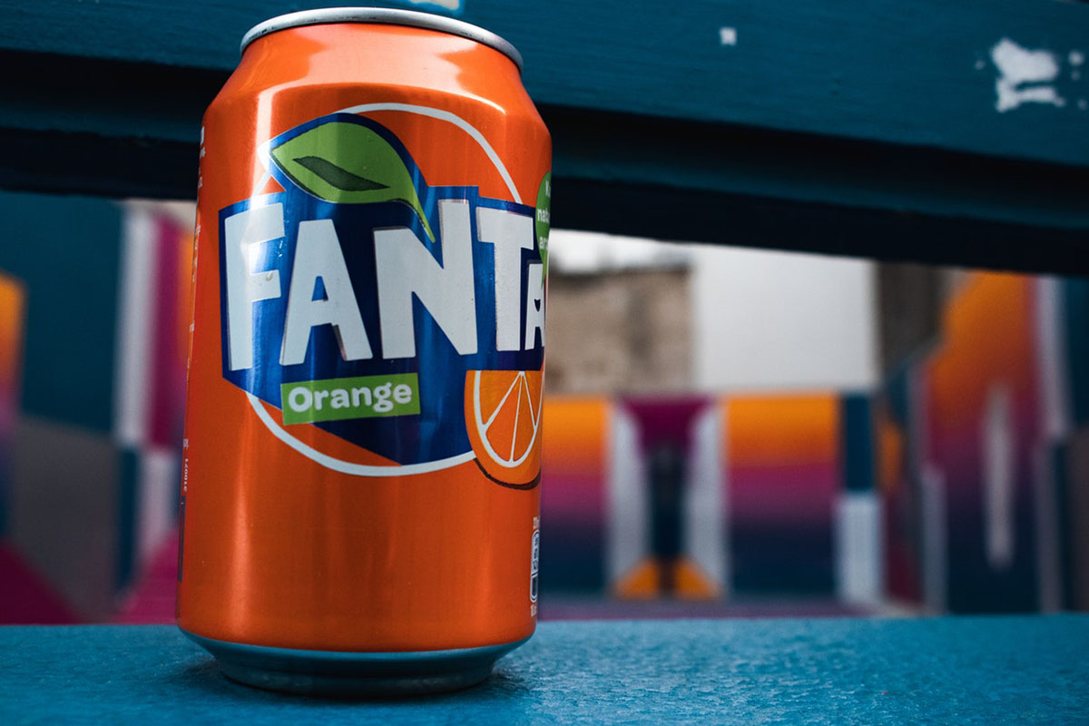
The colour orange is a light-hearted, friendly and playful colour. It is a colour that is occasionally linked to health and natural brands, unsurprisingly due to its connection with the fruit oranges. It is also seen as seasonal around the autumn time with the colour of leaves and the holiday of Halloween.
Yellow
Optimism, creativity and happiness are all feelings associated with yellow. It is most notably recognised as the colour of the sun, which is where it gets its positive feel from. Most businesses tend to use slightly darker shades of yellow, not only because it is more eye catching, but because it established look to it.
Green
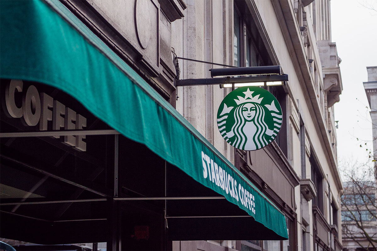
Green is a very heavily associated with nature and the environment, but it also emits hints of health, freshness, wealth and good fortune. Green is the dominant colour for Irish culture and particularly used to celebrate St. Patrick’s Day. Darker shadings of green are frequently used to represent money or financial services.
Blue
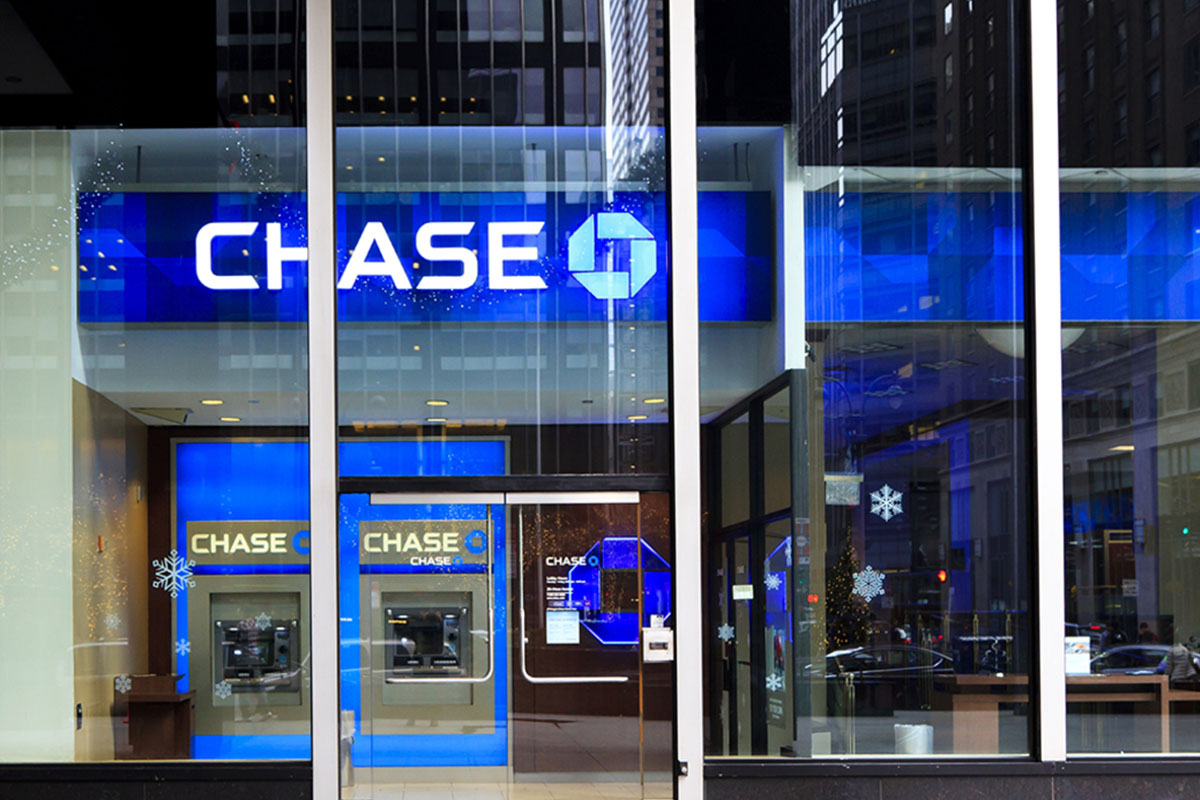
Security services have been using the colour blue since as early as 1829 when the London Metropolitan Police was created. Since then, the colour has been wired into our minds to represent trust, truth, and peace, which has led to banks using the colour too. Water is also unsurprisingly linked with the colour blue and this is why businesses who either use, rely or are based around the use of water will adopt this colour.
Purple
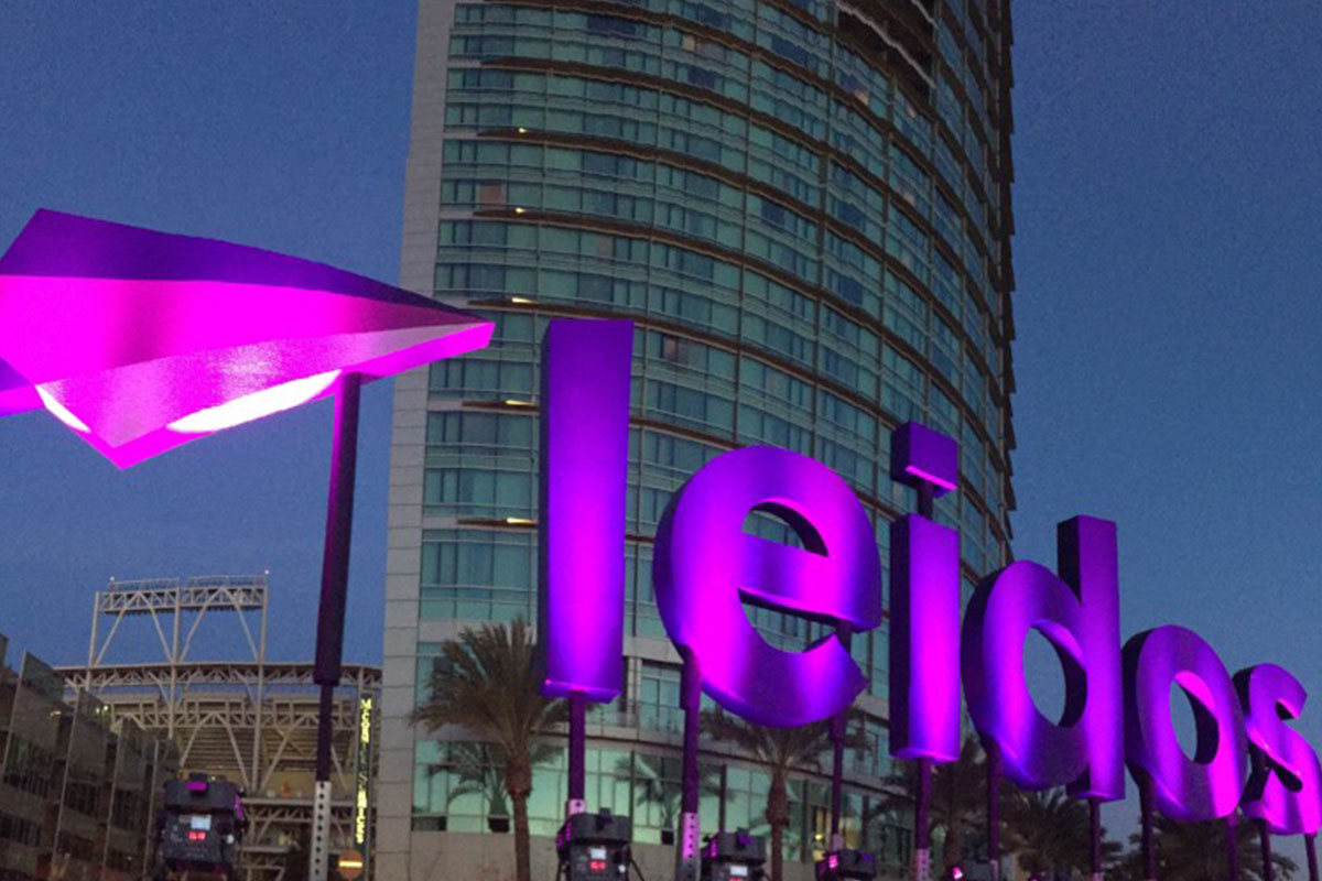
Royalty, wisdom and luxury are all linked to the colour purple. Purple is not as commonly used as the other colours, but this is due to the high-end feel that it gives off. It has an exclusive energy about it, which is utilised by brands who want to appear luxurious and extravagant.
Black
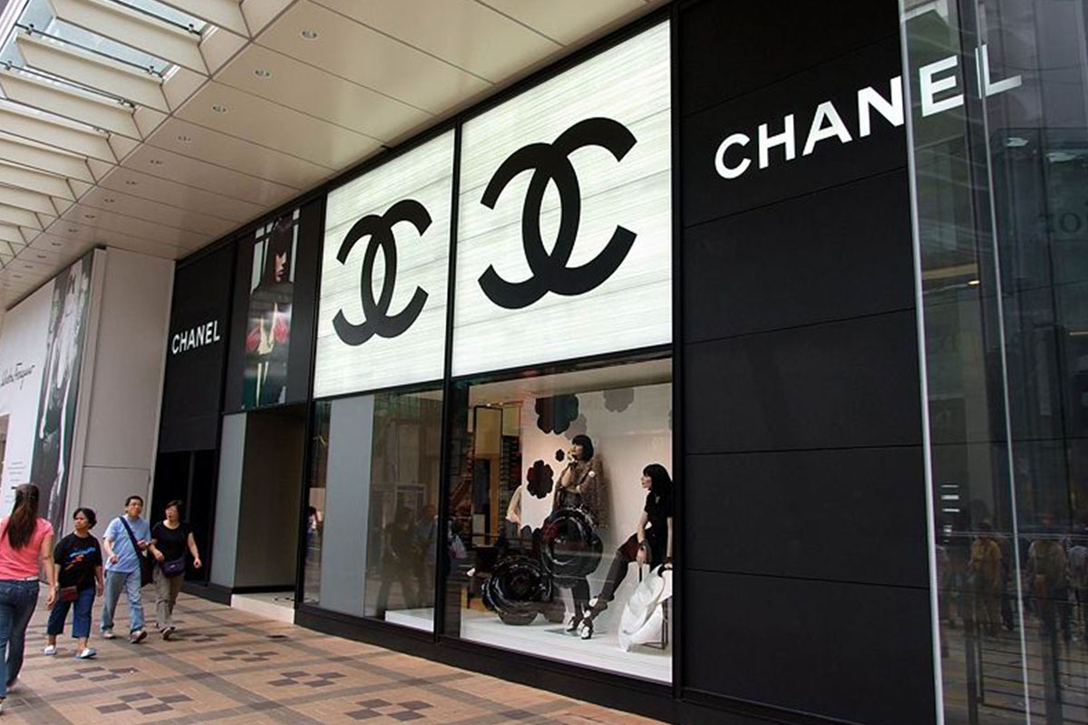
Being one, if not the most strong and powerful colour, black is very sophisticated and is frequently used by modern and minimalistic styled brands. Similar to the colour red, it has both positive and negative associations. On the positive, it represents power, formality and style. The negative connotations include evil, death and fear.
Grey
Grey shares some of the same connotations as black, such as power and formality, however it also has some very unique emotions. Traditionally, grey has been associated with vintage feelings which it earnt from the previous generations of televisions and cameras which didn’t have any colour. Nowadays, grey is starting to be used for more modern and edgy designs. Lighter colours of grey are being used to replace areas previously occupied for white and dark shades of grey are being used to replace the colour black.
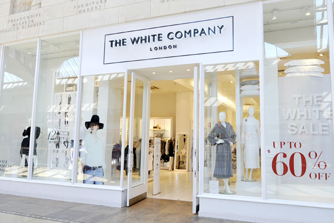
White
White works very well with almost every colour. It provides a very good contrast to some of the stronger colours in the spectrum. White is represented as a clean, pure and simple colour. It is often a popular choice for minimalistic designs alongside grey and its opposite, black. Winter is also heavily associated with the colour white, and so is often used to represent snow in seasonal branding.
Many of these colours have 10s if not 100s of different connotations and it can get quite overwhelming, but we hope that this has simplified it a little and will help you to select the right colour for your next brand or design project.
If you are looking for help with your next branding, design or website project, reach out to us today!