
A large part of what makes a website successful is the presentation and aesthetic appeal. Creative use of images, text and design definitely help, but sometimes less is more. Clean and simple web design is very easy on the eye, and one of the most effective techniques to achieve this is to use white space, also known as negative space.
White space is the unused space on a web page, and despite the name it does not have to be white. White space is being used more and more every day by designers and it’s no surprise as to why. It has been proven to improve the user experience on websites and subconsciously encourages the user to explore more of the page or website.
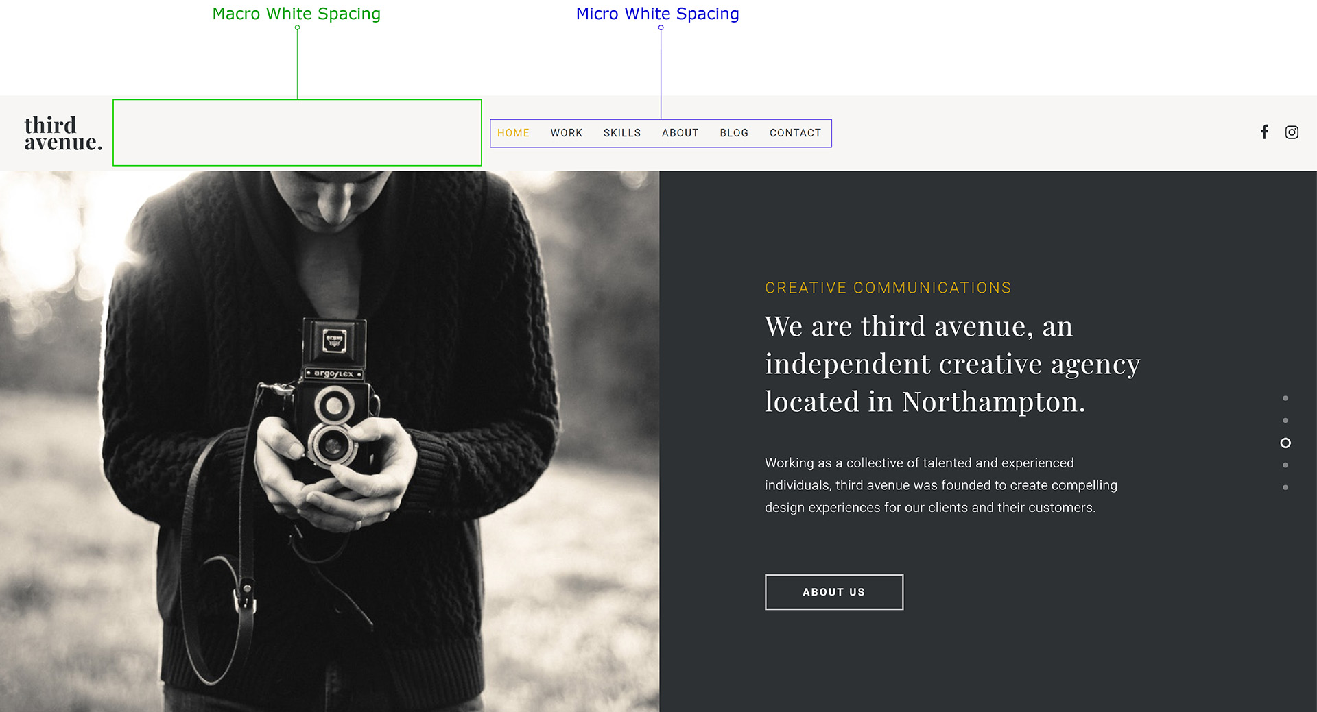
There are two types of white space, micro and macro
Macro white space is the larger open spaces that you tend to see either side of text or images on a website. Macro white space often is seen as “wasted” space, and it is important that you do not make this common mistake. Overpopulated pages not only look ugly, but they also overwhelm the user with information. By using macro white space, you can focus the attention of the user on the content that is important.
Micro white space is the small area in between lines of text or in between paragraphs. This doesn’t just apply to the main content, but also to the text in the menu of the site. The amount of micro white space affects the user readability of the content and so it is vital that you find the perfect balance between too much white space and too little.
Finding the perfect balance
Finding this perfect balance isn’t as easy as it sounds, but an easy way to help you on your way to perfection is to look at sites with good usage of white space such as Google or BBC. Another way to help you find the right balance is through trial and error. The best feedback is going to come from the people who use your site. This can be gauged by viewing the average session time on Google Analytics, which shows you how long the average user spends on a page.
Branding
White space also applies to branding and can give a brand a luxurious and elegant image. White space is used by all high-end brands in almost ever type of market. Below, you can see an example of how white spacing is used to either give an up-scale quality or a down-scaled quality. To learn more about branding, please visit our skills page.

Source: http://alistapart.com/article/whitespace/
This very noticeable change shows the importance or white space and it’s usage, and with brands as big as Bank of America adapting their out-dated logos by changing the amount of white space, you should definitely begin to look into implementing your own use of white space.